How to Use Pantone Baby Clothing Colors: A Guide for Designers

Introduction
When it comes to designing infant clothing, the significance of color cannot be overstated. Baby apparel isn’t just about comfort and fit; it’s also about creating a soothing, visually appealing experience for both babies and their parents. Pantone baby clothing colors provide an ideal palette for designers to work with. These colors are carefully chosen to be both gentle and trendy, ensuring your baby designs stand out without overwhelming the senses.
Did you know that colors can have an impact on a baby’s mood and development? For instance, soft hues like pastel pinks and blues can create a calming atmosphere, while brighter shades may energize and uplift. This guide is here to explore how to utilize Pantone baby clothing colors effectively, ensuring your designs are both stylish and functional for little ones.
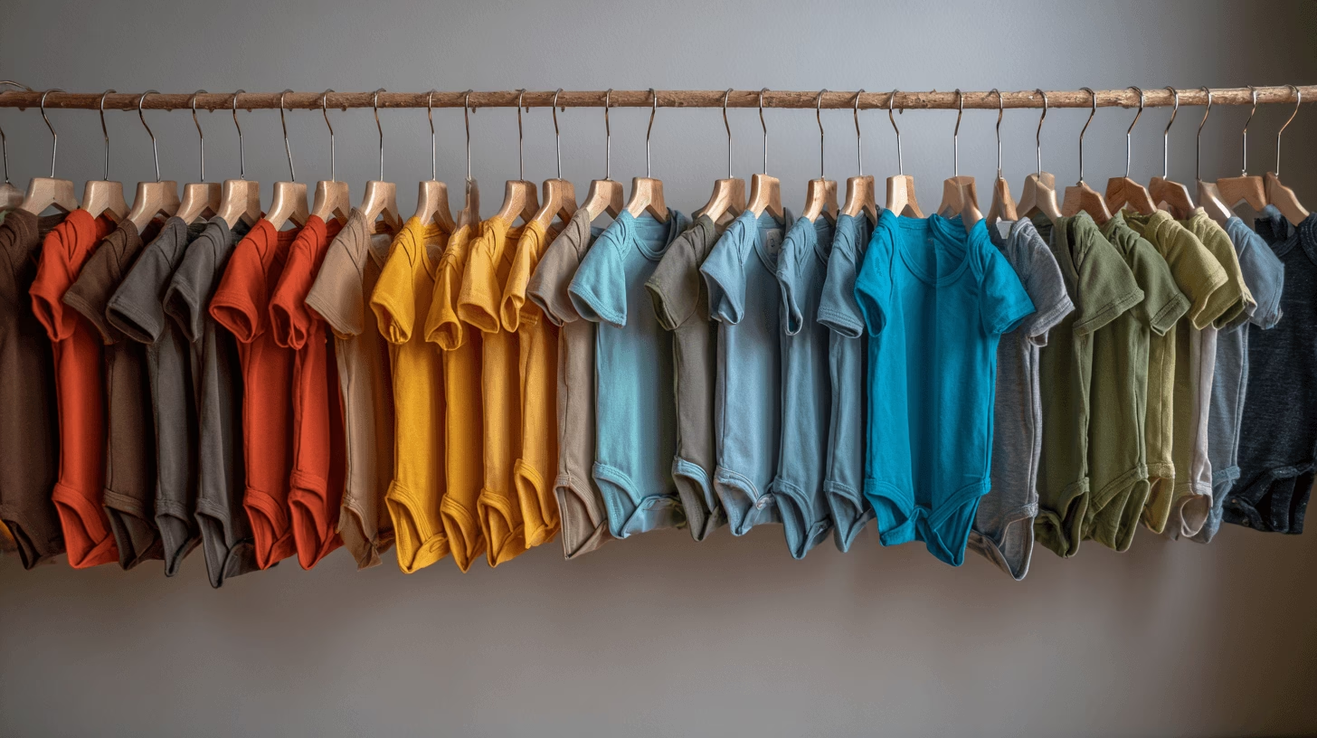
Understanding Pantone Colors for Baby Clothing
What is Pantone and Why is it Important for Baby Clothing?
Pantone is a color matching system that standardizes colors, making it easier for designers, manufacturers, and printers to replicate specific shades consistently. In the context of baby clothing, using Pantone colors allows us to ensure that our designs are uniform and visually balanced, whether they’re printed on a soft onesie or woven into a cozy blanket.
Choosing the right colors for baby clothing is crucial because babies have very sensitive skin. Certain colors can evoke feelings of comfort and calm, which is especially important in the early stages of an infant’s life. Pantone’s soft, neutral, and pastel hues are particularly suited for baby clothing because they create a soothing and gentle atmosphere that aligns with the tender nature of newborns.
The Significance of Choosing the Right Colors for Infants
As I’ve observed in my experience as a designer, the colors we choose for baby apparel can affect not just the aesthetic appeal but also the emotional response of both babies and parents. Babies are particularly responsive to their surroundings, and certain colors, such as soft baby blues, muted yellows, and pale pinks, are calming and comforting. On the other hand, vibrant colors like bright red or neon yellow can overstimulate a baby and may not be ideal for everyday clothing.
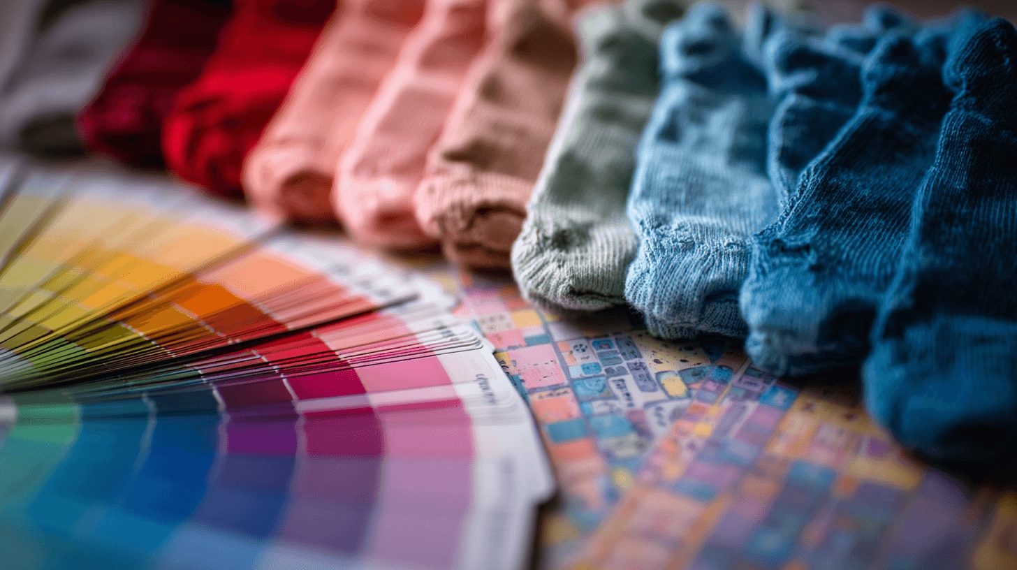
Selecting Pantone Baby Clothing Colors
Factors to Consider When Choosing Pantone Colors for Infant Apparel
When selecting Pantone colors for baby apparel, several factors need to be considered. One of the most important is the baby’s skin tone. Lighter shades such as soft pastels tend to complement fair skin tones, while slightly warmer hues like peachy tones or muted yellows work better for babies with darker skin tones.
Comfort is also a key factor when designing baby clothing. Pantone colors are often applied to fabrics that are soft and breathable, so the color should not only look good but also contribute to the overall comfort of the garment. For instance, organic cotton baby clothing can easily carry Pantone colors and retain their softness without losing their vibrancy.
Seasonality plays a role as well. For colder months, Pantone colors in richer, deeper tones like soft lavender or muted greens are perfect for layering, while lighter, brighter tones work well in spring and summer collections.
How to Create a Harmonious Color Palette for Baby Clothing
One of the key aspects of Pantone baby clothing is building a harmonious color palette. I always aim to use a combination of complementary shades that not only look great together but also evoke the right emotions. For example, pairing soft pastel pinks with muted greys creates a balanced look that’s both sophisticated and calming. On the other hand, combining brighter shades like sunshine yellow with a soft mint green can create an energizing yet gentle palette that feels fresh and fun.
By blending neutral Pantone colors for baby clothing with one or two statement shades, you can create a versatile and stylish collection that can be mixed and matched effortlessly.
Popular Pantone Baby Clothing Colors for 2025 and Beyond
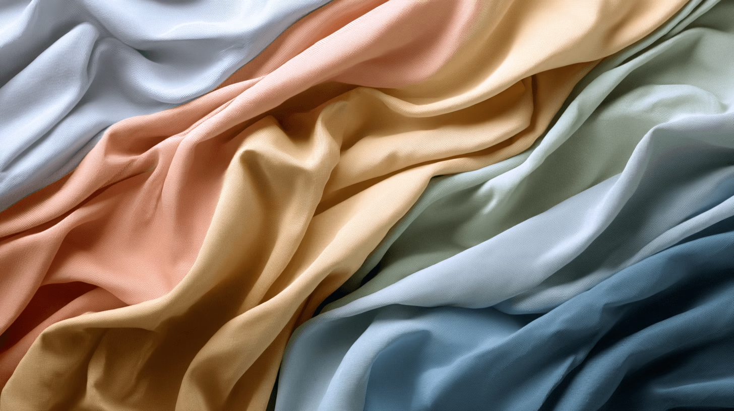
Looking ahead, 2025 Pantone baby colors are expected to focus on soft, timeless hues. Pantone color palettes for baby apparel will likely include soft blues, lavender, peach, and sage green. These shades are not only fashionable but also gender-neutral, catering to a wider range of preferences.
Pantone’s color of the year, a trend-setting hue that influences a variety of industries, is also worth keeping an eye on. If you’re designing baby clothing for 2025, incorporating this color can add an extra layer of relevance to your collection, aligning your designs with the latest trends.
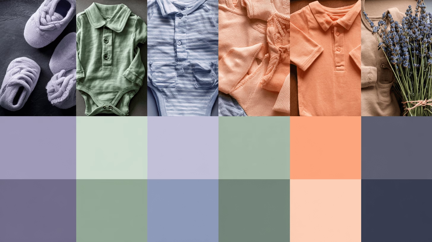
Pantone Color Trends for Infant Clothing
Overview of Current Pantone Trends in Baby Fashion
The world of baby fashion is constantly evolving, and Pantone color trends for infant clothing are an essential part of these changes. In recent years, there has been a strong shift towards gender-neutral colors for baby clothes, reflecting a broader cultural movement towards inclusivity. Light greys, soft greens, and neutral tones are growing in popularity as parents seek clothing that doesn’t adhere to traditional gender norms.
Bright colors for babies have also made a comeback, but in a more muted form. For instance, pastel versions of typically bold hues like orange and blue are gaining traction. These softer tones still evoke the energy of bright colors but with a gentler, more baby-friendly touch.
How to Integrate Trending Colors into Timeless Designs
As a designer, my challenge is always balancing current trends with timeless appeal. I find that incorporating Pantone color trends into classic designs—like a simple onesie or a cozy blanket—helps keep the clothing stylish and relevant while ensuring it remains practical and enduring. Using Pantone’s fashion color guide, you can blend trending colors with classic baby clothing styles for a fresh yet lasting appeal.
For example, adding a pop of Pantone’s “Living Coral” (color of the year) into a neutral-toned romper can add a contemporary twist without overwhelming the overall design. It’s all about subtlety and thoughtful integration.
Examples of Successful Pantone Baby Clothing Color Combinations
Some of my favorite combinations include pairing “Powder Blue” with “Lavender Gray” for a soft, gender-neutral look. Similarly, mixing Pantone’s “Soft Peach” with a muted “Pistachio Green” creates a fun and cheerful vibe without being too bold.
These color combinations not only reflect current Pantone baby clothing color trends but also stay true to the calming, soothing palette that is essential for infant apparel.
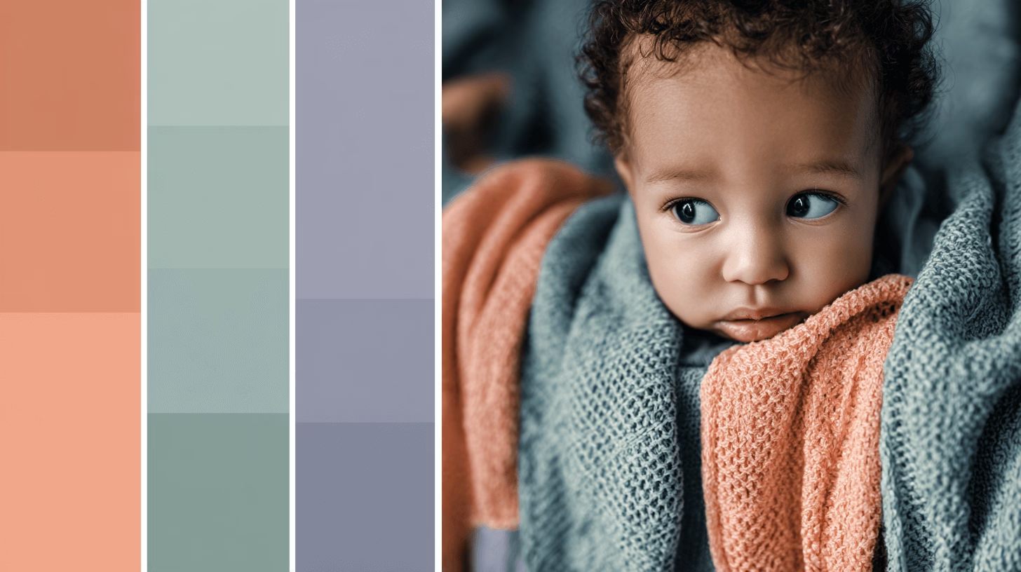
Using Pantone Colors in Different Fabrics for Baby Clothing
Best Fabrics for Using Pantone Colors in Baby Clothing
When working with Pantone colors, fabric choice is critical. I love using fabrics like organic cotton baby clothing for its softness and breathability. Cotton is an excellent choice for Pantone colors, as it holds hues beautifully and offers the comfort babies need. Organic cotton also appeals to environmentally conscious parents, making it an even better choice for your designs.
Another great fabric for Pantone baby apparel is bamboo fabric. Known for its softness and eco-friendly nature, bamboo fabric holds color well and is gentle on babies’ skin. For cooler months, flannel is a fantastic option because it can carry deeper Pantone colors without losing warmth.
How Color Behaves in Various Textiles
Not all fabrics react to Pantone colors in the same way. For instance, natural fibers like cotton and linen tend to absorb color more deeply than synthetic fabrics like polyester. As a designer, it’s important to test Pantone color matching before finalizing any designs, especially if you plan to use a variety of fabrics.
In my experience, I’ve noticed that some Pantone colors, like soft pastels, appear more vibrant on organic cotton than on other fabrics. To maintain color accuracy, always do a few test runs to ensure the color remains consistent throughout the production process.
Tips for Ensuring Pantone Colors Stay True on Different Fabrics
One of the best tips I can offer is to work closely with your fabric supplier. Ensure they understand Pantone color accuracy and are capable of replicating the exact hues on the fabrics you’re using. Also, make sure to conduct wash tests—some fabrics may cause colors to fade or change slightly after washing, so it’s always best to verify the color’s stability before proceeding with large-scale production.
Practical Tips for Designers Using Pantone Colors in Baby Clothing
Tools for Selecting Pantone Colors Accurately
When it comes to Pantone color matching, accuracy is essential. I highly recommend using the Pantone Color Bridge or Pantone Swatch Book for selecting the right shades for your designs. These tools provide a physical reference for colors, allowing you to see exactly how a Pantone color will appear on fabric before production.
For digital designs, Pantone’s online tools, such as the Pantone Color Finder, are invaluable for ensuring that your color selections are as accurate as possible. These tools help ensure that your colors are consistent across different mediums, which is especially important when working with multiple manufacturers or printing on different fabrics.
Collaborating with Manufacturers to Match Pantone Shades
One of the most important steps in the design process is collaborating with manufacturers to ensure your Pantone color choices are matched correctly. Communication is key! Always send your Pantone swatches and color guides to the manufacturer, so they have a clear reference for the exact color you want.
I have learned that visiting the production site in person, if possible, can significantly help in ensuring Pantone colors are accurately applied. This direct collaboration also helps in managing any color discrepancies and allows for adjustments before the final production run.
Common Mistakes to Avoid When Using Pantone Colors in Baby Apparel
Over the years, I’ve seen several common mistakes that designers make when working with Pantone colors for baby clothing. One of the most frequent errors is underestimating how color can change during production. A color may look slightly different on screen, in print, and when applied to fabric. To avoid disappointment, always conduct a sample run of your designs and verify that the Pantone color you selected matches your vision.
Another mistake is ignoring fabric limitations. Some fabrics may not hold color as well as others, which can lead to inconsistency in your designs. Always test Pantone colors on the fabric you’re using and adjust your color choices accordingly if necessary.
Conclusion
Using Pantone baby clothing colors is about more than following trends—it’s about creating designs that are both beautiful and functional, ensuring that your baby apparel is not only stylish but also gentle and comforting. Whether you are designing with organic cotton baby clothing or exploring the latest Pantone color trends for 2025, the key is to strike a balance between aesthetic appeal and comfort.
Through careful selection of Pantone colors, thoughtful use of fabrics, and effective collaboration with manufacturers, you can create designs that both parents and babies will love. Don’t forget that Pantone’s color systems are an invaluable resource for consistency, which is crucial when designing collections that will be produced at scale.
Ready to get started? Dive into Pantone’s color guides, experiment with soft hues for babies, and start designing your perfect baby clothing collection today. Whether you’re aiming for sustainable baby clothing colors or looking to create the best colors for infant apparel, the possibilities are endless.
About the author
Xhiney, founder of Petelulu, brings over 20 years of experience in children’s wear design, production, and international trade. A contributor to Children’s Wear and Junior magazines, Xhiney has spent 17 years working with high-end children’s wear brands in Europe and the U.S., offering expert insights and support.
